React Component Design Patterns: The Building Blocks (LEGO)
A practical guide to React component design patterns using simple LEGO analogies.
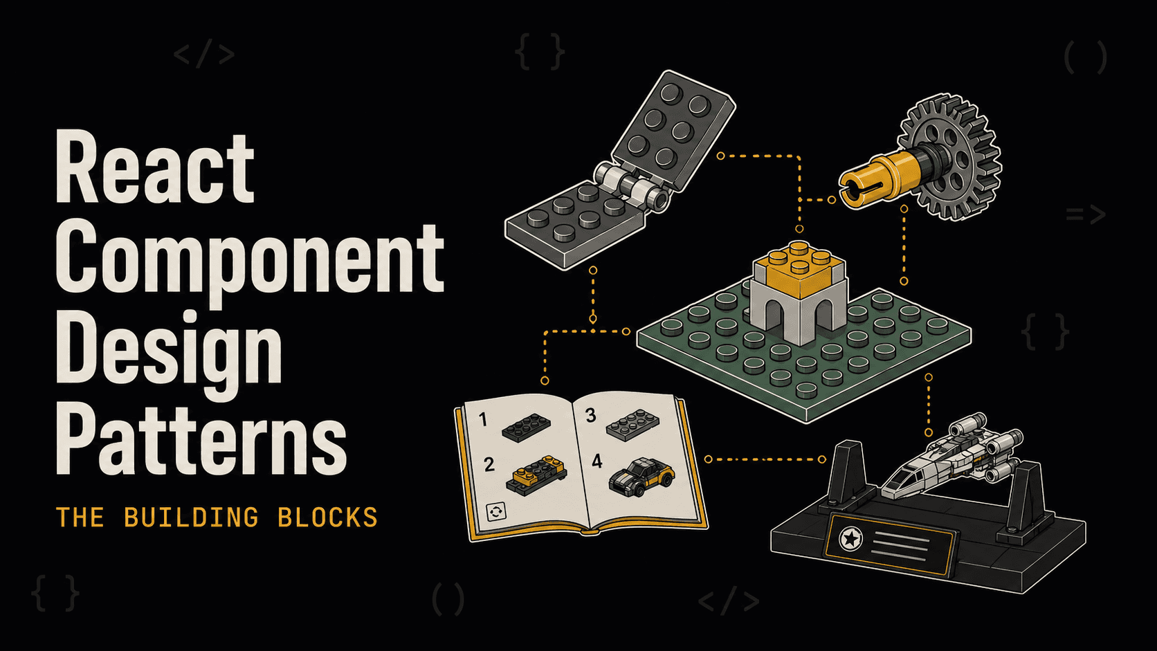
React Component Design Patterns: The Building Blocks
Wise Coding Visual Explainer #01 · 14 min read · Visual Explainers
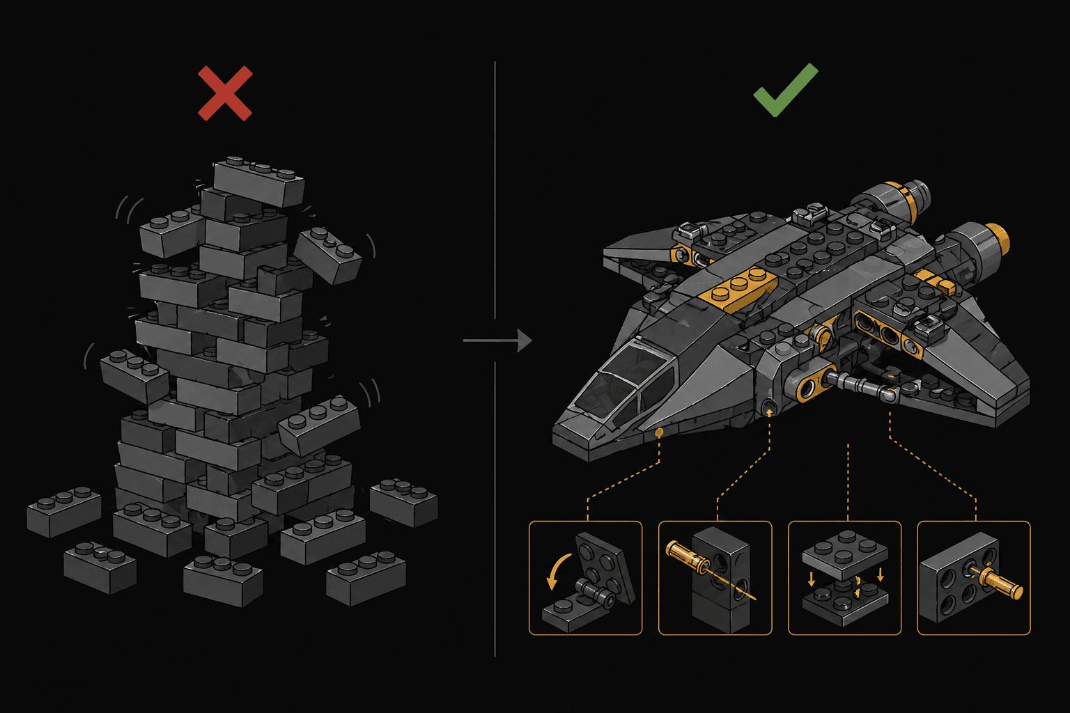
Every React app is a box of LEGO bricks. The difference between a wobbly tower and the Millennium Falcon isn't the bricks. It's how you connect them.
The Problem Nobody Talks About
You've been writing React for a while. You can build components, manage state, handle side effects. But somewhere around the 50th component in your app, things start to feel off. Props cascade through five levels of nesting. Components that started simple now accept 15 props. You copy-paste logic between components because you can't figure out how to share it cleanly.
The issue isn't your skill. It's that nobody taught you the connection patterns.
Think about LEGO. Every set uses the same basic bricks. What makes the Millennium Falcon different from a simple house isn't the bricks, it's the connection techniques. Some bricks snap on top. Some slide into the side. Some use hinges. Some use Technic pins that create completely new structural possibilities.
React components work the same way. The "bricks" are your components. The "connection techniques" are design patterns. And mastering them is what separates a developer who builds things that work from one who builds things that scale.
Let's learn five connection types that will change how you think about React.
Pattern 1: Compound Components
🧱 The LEGO Analogy: Hinge Pieces
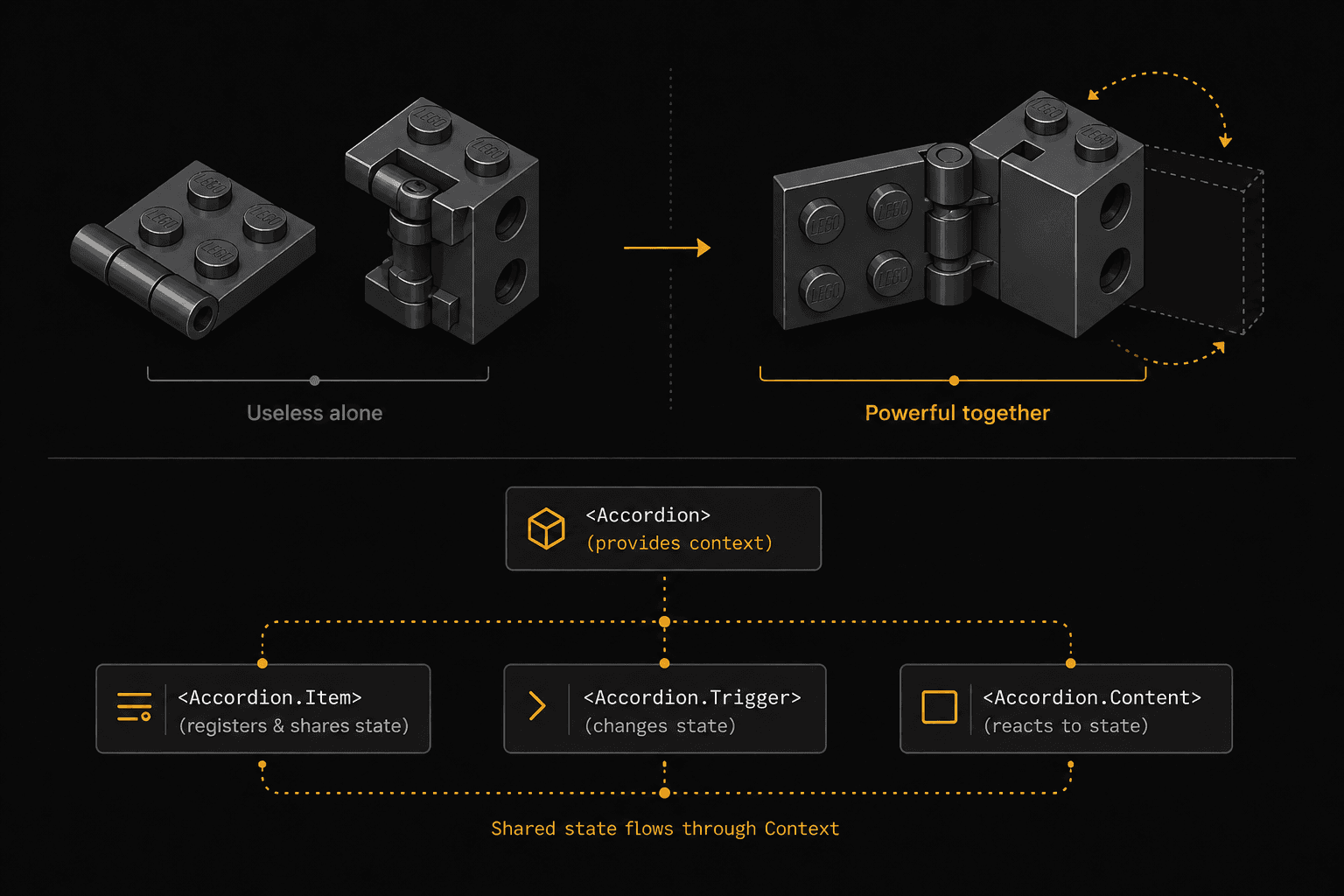
A LEGO hinge plate is useless without its hinge brick. But snap them together and you get something neither could create alone. Doors that open, wings that fold, cockpits that tilt. Two pieces, one shared mechanism.
Compound components are a set of components that only make sense together, sharing hidden internal state.
You already use this pattern. Think about native HTML:
<select>
  <option value="react">React</option>
  <option value="vue">Vue</option>
</select>
An <option> outside a <select> is meaningless. The <select> manages which option is selected, and the children don't need to know how. That's compound components.
The Real-World Problem
Say you're building an accordion. The naive approach looks like this:
// ❌ The "prop soup" approach
<Accordion
  items={[
    { title: "Section 1", content: "...", icon: <ChevronDown />, disabled: false },
    { title: "Section 2", content: "...", icon: <ChevronDown />, disabled: true },
  ]}
  allowMultiple={true}
  defaultOpen={[0]}
  onChange={handleChange}
  variant="bordered"
/>
It works, but it's rigid. Want a custom header layout? Add more props. Want a divider between items? More props. Every new requirement means modifying the component's API, and eventually you end up with a 30-prop monster that nobody wants to touch.
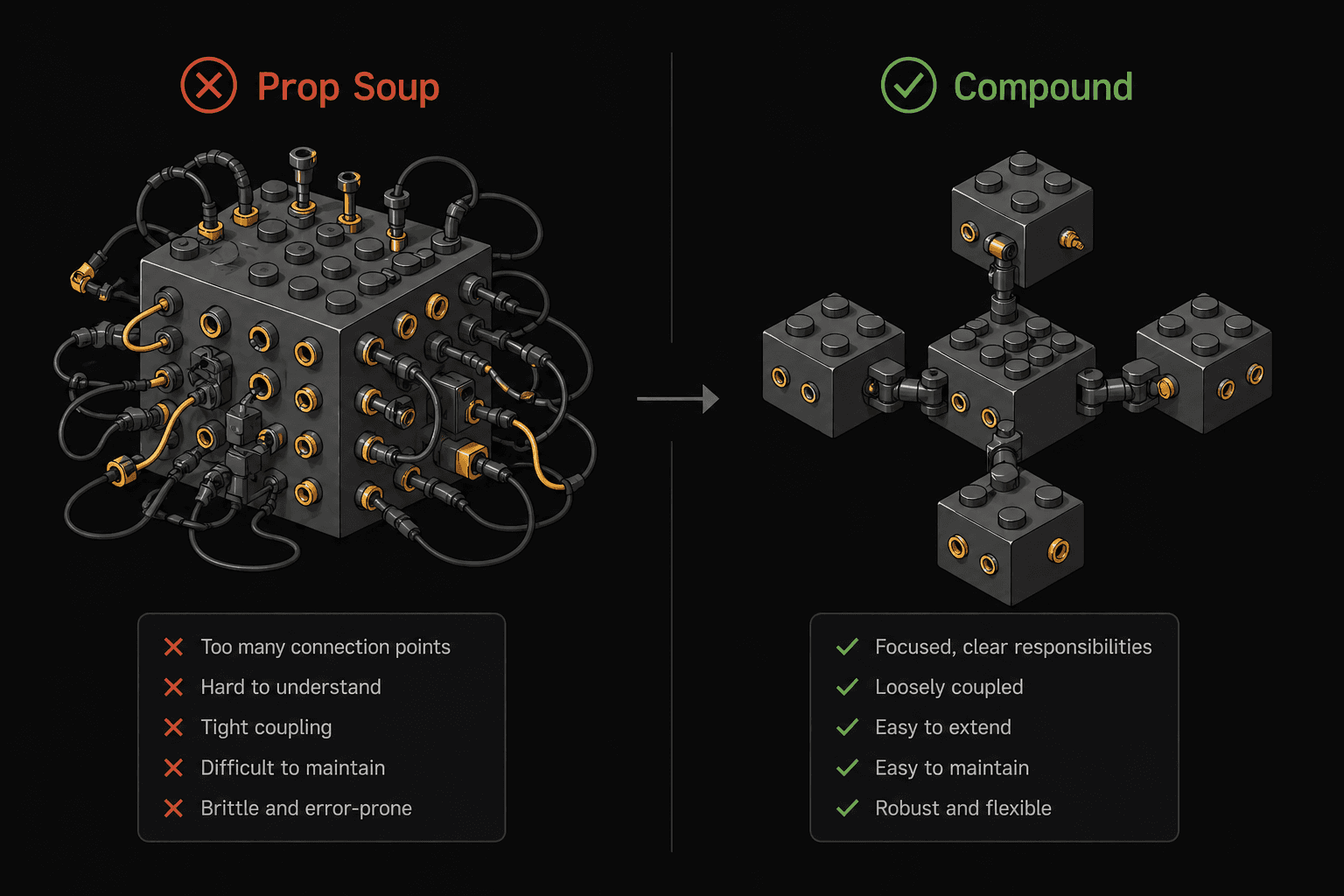
The Compound Components Solution
// ✅ Compound components: flexible, readable, composable
<Accordion defaultOpen={[0]} allowMultiple>
  <Accordion.Item>
    <Accordion.Trigger>
      <span>Section 1</span>
      <ChevronIcon />
    </Accordion.Trigger>
    <Accordion.Content>
      <p>This content can be literally anything.</p>
    </Accordion.Content>
  </Accordion.Item>

  <Accordion.Item disabled>
    <Accordion.Trigger>Section 2 (disabled)</Accordion.Trigger>
    <Accordion.Content>Hidden content</Accordion.Content>
  </Accordion.Item>
</Accordion>
Notice what happened. The consumer now controls the layout. Want a custom icon? Just put it inside Accordion.Trigger. Want a divider? Drop a <hr /> between items. The parent Accordion manages the open/close state internally via Context and shares it with its children without the consumer needing to wire anything.
How It Works Under the Hood
const AccordionContext = createContext();

function Accordion({ children, allowMultiple, defaultOpen = [] }) {
  const [openItems, setOpenItems] = useState(defaultOpen);

  const toggle = (index) => {
    setOpenItems((prev) => {
      if (prev.includes(index)) return prev.filter((i) => i !== index);
      return allowMultiple ? [...prev, index] : [index];
    });
  };

  return (
    <AccordionContext.Provider value={{ openItems, toggle }}>
      <div>{children}</div>
    </AccordionContext.Provider>
  );
}

// Child components access shared state via context
function AccordionItem({ children, disabled }) {
  // Each item gets its index from the parent
  // and uses context to check if it's open
}

// Attach sub-components as properties
Accordion.Item = AccordionItem;
Accordion.Trigger = AccordionTrigger;
Accordion.Content = AccordionContent;
The key insight here: the parent owns the state, children consume it through Context, and the consumer gets full control over structure and layout.
When to Use It
- You're building a component library (tabs, accordions, dropdowns, menus)
- Multiple child components need to share state without prop drilling
- You want consumers to control the markup structure while you control the behavior
When NOT to Use It
- Simple components with 2-3 props. Don't over-engineer.
- When the component's structure should be enforced, not flexible
Pattern 2: Render Props
🧱 The LEGO Analogy: The Technic Pin
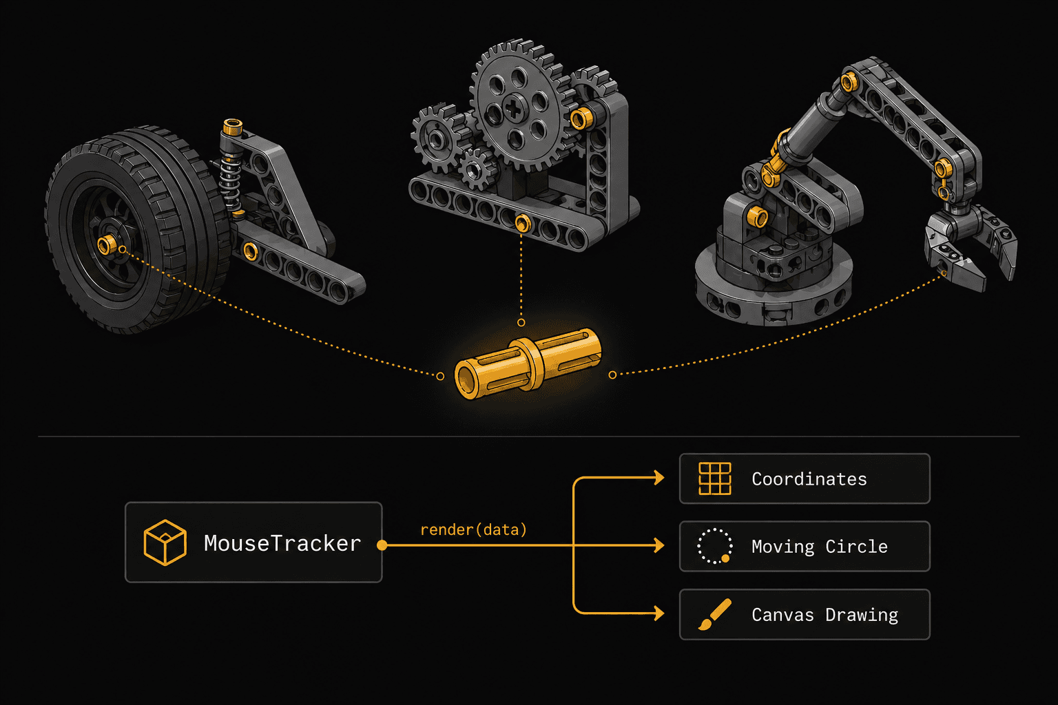
A Technic pin is a tiny connector that lets you attach bricks in ways standard studs can't. It doesn't do anything visible by itself. It just creates a connection point that other pieces can plug into. The pin doesn't know or care what will attach to it.
Render props let a component expose its internal data through a function, giving the consumer complete control over what gets rendered.
The Real-World Problem
You've built a mechanism that tracks the mouse position. Multiple components need this data, but each one renders it completely differently. One shows coordinates, another moves an element, another draws on a canvas.
The Render Props Solution
// The component that owns the logic
function MouseTracker({ render }) {
  const [position, setPosition] = useState({ x: 0, y: 0 });

  useEffect(() => {
    const handleMove = (e) => setPosition({ x: e.clientX, y: e.clientY });
    window.addEventListener("mousemove", handleMove);
    return () => window.removeEventListener("mousemove", handleMove);
  }, []);

  return render(position);
}
Now any component can plug into this data and render whatever it wants:
// Consumer 1: Show coordinates
<MouseTracker
render={({ x, y }) => (
<p>Mouse is at ({x}, {y})</p>
)}
/>

// Consumer 2: Move an element
<MouseTracker
render={({ x, y }) => (
<div style={{
position: "fixed",
left: x - 20,
top: y - 20,
width: 40,
height: 40,
borderRadius: "50%",
background: "coral",
}} />
)}
/>

// Consumer 3: Use as children (same concept)
<MouseTracker>
{({ x, y }) => <span>({x}, {y})</span>}
</MouseTracker>
MouseTracker doesn't know what the UI looks like. It provides the data through a function "pin" and lets the consumer decide. Logic and presentation, fully separated.
Render Props vs. Custom Hooks
These days, you'd often reach for a custom hook instead:
function useMousePosition() {
  const [position, setPosition] = useState({ x: 0, y: 0 });

  useEffect(() => {
    const handleMove = (e) => setPosition({ x: e.clientX, y: e.clientY });
    window.addEventListener("mousemove", handleMove);
    return () => window.removeEventListener("mousemove", handleMove);
  }, []);

  return position;
}

// Usage
function MyComponent() {
  const { x, y } = useMousePosition();
  return <p>({x}, {y})</p>;
}
So when would you still use render props over hooks?
- When the consuming component is class-based (hooks don't work in classes)
- When you need conditional rendering based on the data and want to keep it declarative in JSX
- When building headless UI libraries that expose behavior without opinions on markup (think Downshift, React Table v7)
When to Use It
- Sharing logic between components that render completely different UI
- Building headless/unstyled component libraries
- When you need extreme flexibility in what gets rendered
When NOT to Use It
- If a custom hook achieves the same result with less nesting
- Simple data sharing where Context or props work fine
Pattern 3: Higher-Order Components (HOC)
🧱 The LEGO Analogy: The Baseplate
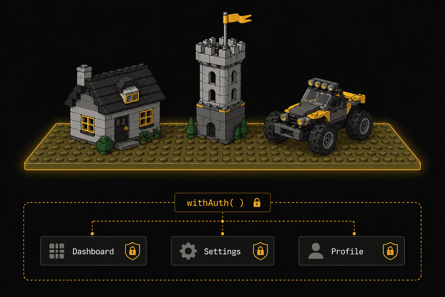
A LEGO baseplate doesn't look like much. It's just a flat green or gray surface. But every structure built on it automatically gains stability, a coordinate system, and a foundation. The buildings don't need to know about the baseplate's properties. They just benefit from being placed on it.
An HOC is a function that takes a component and returns a new component with additional capabilities baked in, without the original component knowing.
The Pattern
// The HOC: adds authentication awareness to ANY component
function withAuth(WrappedComponent) {
  return function AuthenticatedComponent(props) {
    const { user, isLoading } = useAuth();

    if (isLoading) return <Spinner />;
    if (!user) return <Navigate to="/login" />;

    return <WrappedComponent {...props} user={user} />;
  };
}
Now any component can gain auth protection by being "placed on the baseplate":
// Before: plain component, no auth awareness
function Dashboard({ user }) {
  return <h1>Welcome, {user.name}</h1>;
}

// After: same component, now protected
const ProtectedDashboard = withAuth(Dashboard);

// Usage: just render it normally
<ProtectedDashboard />
Dashboard has no idea it's wrapped. It just receives user as a prop and renders. The HOC handled the auth check, the loading state, and the redirect. All invisibly.
Real-World HOC Examples You've Used
connect()from Redux (wraps your component with store access)withRouter()from React Router v5 (injects history, location, match)memo()from React itself (wraps with memoization)
The Stacking Problem
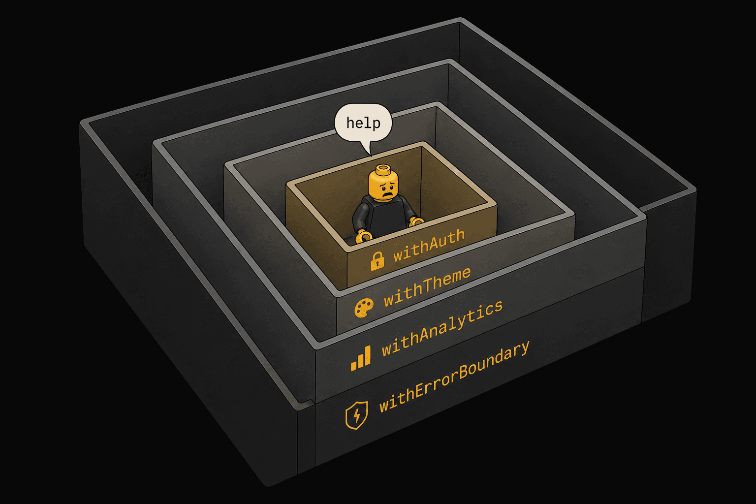
HOCs compose by wrapping, and when you stack them, things get noisy:
// HOC stacking: "wrapper hell"
export default withAuth(
  withTheme(
    withAnalytics(
      withErrorBoundary(Dashboard)
    )
  )
);
Each HOC adds a layer in the React DevTools tree, making debugging harder. This is the main reason hooks replaced most HOC use cases. Hooks compose without nesting.
When to Use It (Still, in 2026)
- Cross-cutting concerns that apply identically to many components: error boundaries, analytics tracking, permission gates
- When working with class components that can't use hooks
- When you need to intercept or modify props before they reach a component
When NOT to Use It
- Logic that varies between components (use a hook or render prop instead)
- When hooks achieve the same result. They almost always will.
- When you're stacking more than 2 HOCs. Refactor to hooks.
Pattern 4: Custom Hooks (Composition)
🧱 The LEGO Analogy: The Instruction Manual
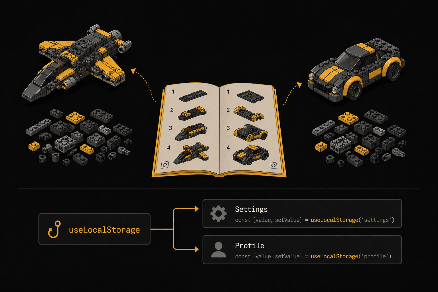
A LEGO instruction manual isn't a physical piece. You can't see it in the final build. But it encapsulates a sequence of steps that anyone can follow to get the same result. Swap the manual and the same bricks become a spaceship instead of a car.
Custom hooks encapsulate reusable logic. A recipe that any component can follow to get the same capability.
The Pattern
function useLocalStorage(key, initialValue) {
  const [value, setValue] = useState(() => {
    try {
      const stored = window.localStorage.getItem(key);
      return stored ? JSON.parse(stored) : initialValue;
    } catch {
      return initialValue;
    }
  });

  useEffect(() => {
    window.localStorage.setItem(key, JSON.stringify(value));
  }, [key, value]);

  return [value, setValue];
}
Any component can now follow this "manual":
function Settings() {
  const [theme, setTheme] = useLocalStorage("theme", "dark");
  const [fontSize, setFontSize] = useLocalStorage("fontSize", 16);

  return (
    <div>
      <button onClick={() => setTheme(theme === "dark" ? "light" : "dark")}>
        Toggle theme
      </button>
      <input
        type="range"
        value={fontSize}
        onChange={(e) => setFontSize(Number(e.target.value))}
      />
    </div>
  );
}
The component doesn't know about localStorage. It follows the hook's recipe and gets persistent state. Swap useLocalStorage for useSessionStorage or useCloudSync and the component doesn't change at all.
Composing Hooks Into Bigger Hooks
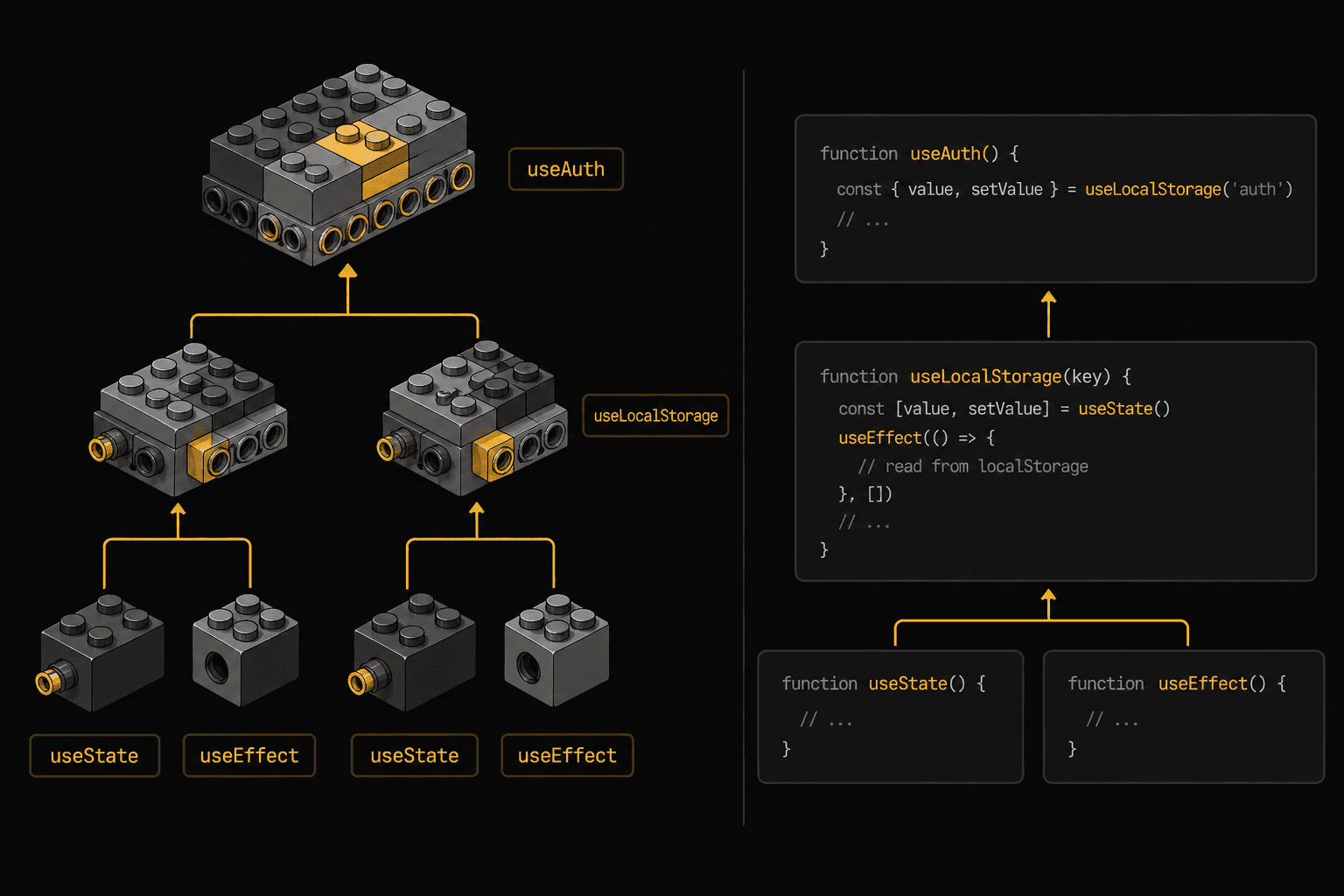
This is where hooks really shine. They compose into other hooks:
function useAuth() {
  const [user, setUser] = useLocalStorage("user", null);
  const [token, setToken] = useLocalStorage("token", null);

  const login = async (credentials) => {
    const response = await api.login(credentials);
    setUser(response.user);
    setToken(response.token);
  };

  const logout = () => {
    setUser(null);
    setToken(null);
  };

  return { user, token, login, logout, isAuthenticated: !!token };
}
useAuth is built from useLocalStorage, which is built from useState and useEffect. Like LEGO manuals that reference sub-assemblies: "build the engine first (page 12), then attach it to the chassis."
When to Use It
- Your first choice for sharing stateful logic in 2026. Almost always.
- Any reusable behavior: data fetching, form handling, media queries, intersection observers, timers, WebSocket connections
- When you want to compose multiple behaviors together cleanly
When NOT to Use It
- Pure UI logic with no state (just write a utility function)
- When you need to share UI structure, not just logic (use compound components instead)
Pattern 5: Container/Presentational
🧱 The LEGO Analogy: The Display Stand
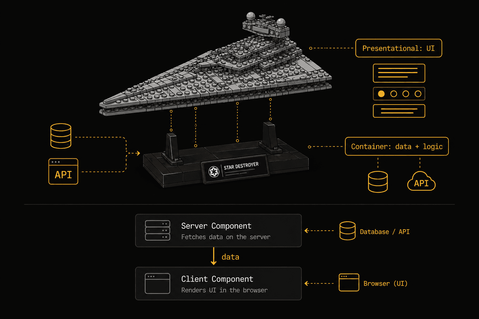
Museum LEGO sets come with a display stand. A separate base that holds the model for viewing. The stand handles positioning. The model is the "thing." They're built separately and combined at the end.
Container components handle data and logic. Presentational components handle how things look. Built separately, composed together.
The Pattern
// Container: handles data fetching, state, business logic
function UserListContainer() {
  const [users, setUsers] = useState([]);
  const [loading, setLoading] = useState(true);
  const [filter, setFilter] = useState("");

  useEffect(() => {
    fetchUsers().then((data) => {
      setUsers(data);
      setLoading(false);
    });
  }, []);

  const filteredUsers = users.filter((u) =>
    u.name.toLowerCase().includes(filter.toLowerCase())
  );

  return (
    <UserList
      users={filteredUsers}
      loading={loading}
      filter={filter}
      onFilterChange={setFilter}
    />
  );
}

// Presentational: pure UI, receives everything through props
function UserList({ users, loading, filter, onFilterChange }) {
  if (loading) return <Skeleton count={5} />;

  return (
    <div>
      <input
        value={filter}
        onChange={(e) => onFilterChange(e.target.value)}
        placeholder="Search users..."
      />
      {users.map((user) => (
        <UserCard key={user.id} user={user} />
      ))}
    </div>
  );
}
The presentational component is pure. Same props in, same UI out. You can test it with mock data, render it in Storybook, reuse it in a completely different context. The container is the only part that knows where data comes from.
The Modern Take
With React Server Components, this pattern is having a comeback:
// Server Component (container): runs on the server, fetches data directly
async function UserListPage() {
  const users = await db.users.findMany();
  return <UserList users={users} />;
}

// Client Component (presentational): handles interactivity
"use client";
function UserList({ users }) {
  const [filter, setFilter] = useState("");
  const filtered = users.filter(u => u.name.includes(filter));

  return (
    <div>
      <input value={filter} onChange={e => setFilter(e.target.value)} />
      {filtered.map(u => <UserCard key={u.id} user={u} />)}
    </div>
  );
}
Server Components are containers by nature. They fetch data, handle business logic, and pass it down. Client Components receive data and handle interactivity. The pattern maps perfectly.
When to Use It
- When you want to reuse the same UI with different data sources
- When building a design system or component library (presentational components only)
- With React Server Components. The split happens naturally.
When NOT to Use It
- Don't create a container for every component. Only when the data-fetching logic is genuinely reusable or complex.
- Simple components that fetch one thing and render it? Just do it inline.
The Cheat Sheet: When to Use What
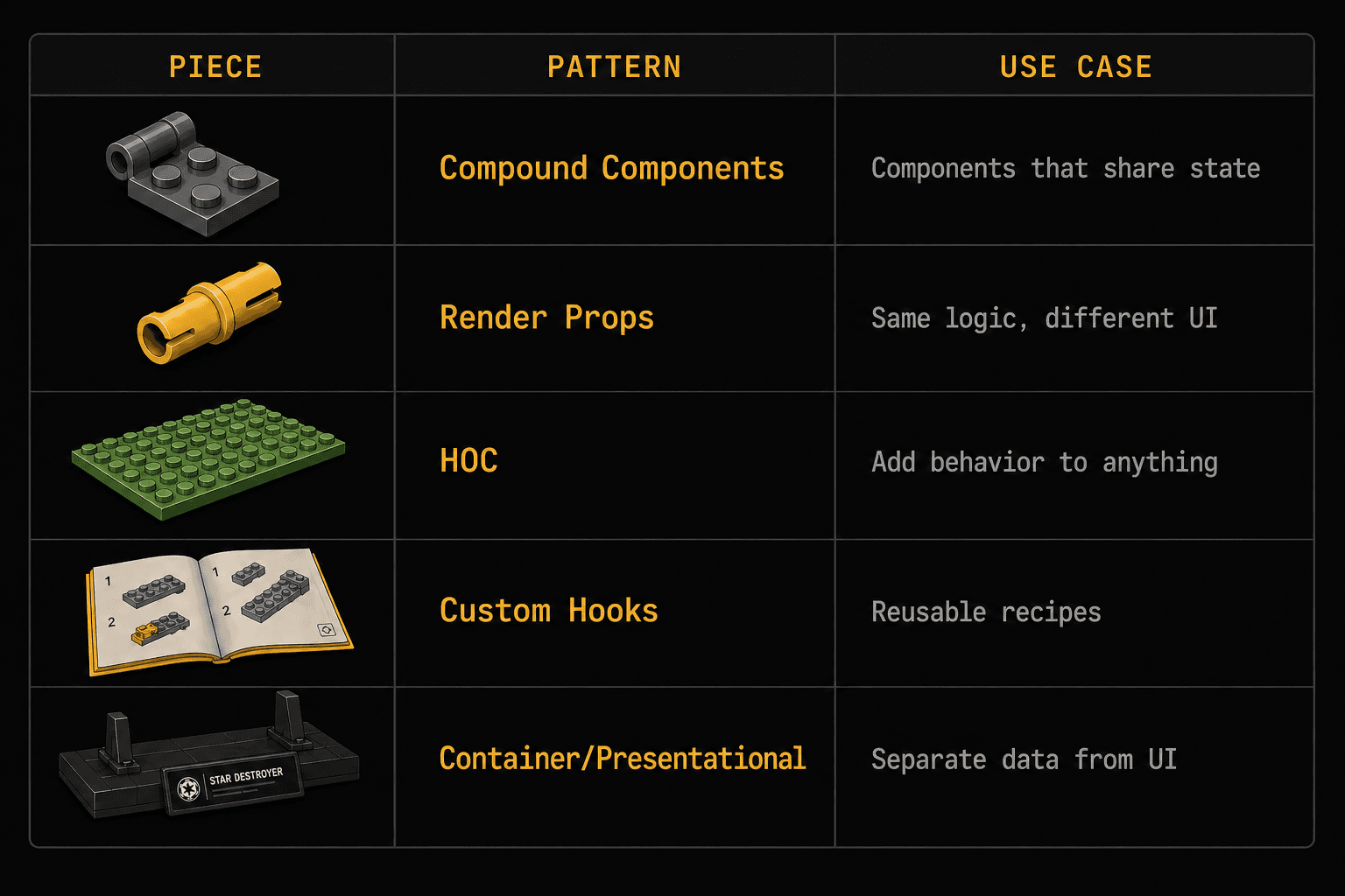
Situation
Pattern
LEGO Analogy
Multiple sub-components sharing state (tabs, accordions, menus)
Compound Components
Hinge: two pieces, one mechanism
Sharing logic where consumers render completely different UI
Render Props
Technic Pin: connection point, you decide what plugs in
Adding identical behavior to many unrelated components
HOC
Baseplate: invisible foundation, automatic benefits
Sharing stateful logic between any components
Custom Hooks
Instruction Manual: same recipe, different builds
Separating data logic from UI
Container/Presentational
Display Stand: model and base built separately
The Bigger Picture
These patterns aren't competing options. In a real codebase, they layer together:
Container (fetches data)
└── Compound Component (manages shared UI state)
└── uses Custom Hooks (reusable logic)
└── Presentational children (pure UI)
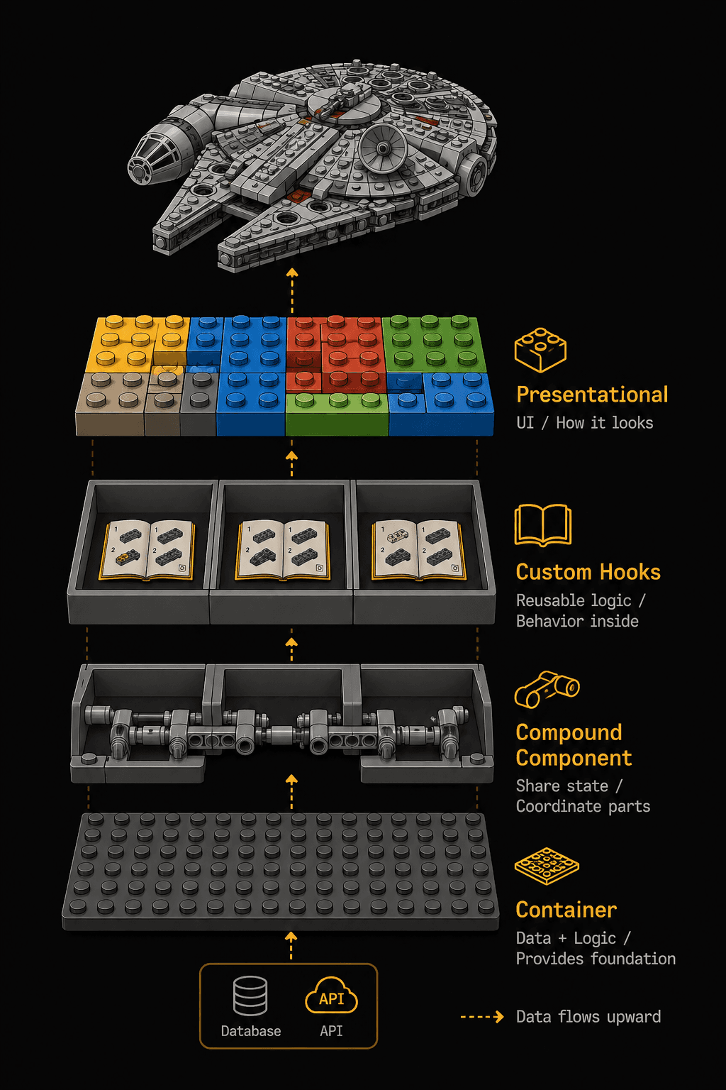
A <DataTable> container fetches rows from an API using a usePagination custom hook. It renders a compound <Table>with <Table.Header>, <Table.Body>, and <Table.Pagination> sub-components that share sort/filter state via Context. Each cell is a presentational component that just receives data and renders.
That's not over-engineering. That's structure. Each layer has one job. When requirements change (and they will), you modify one layer without touching the others.
The LEGO Millennium Falcon has 7,541 pieces. It doesn't hold together because of one magic technique. It holds together because every section uses the right connection type for its structural role.
Your React app is the same. Learn the connections. Build the Falcon.
This is the first article in the Wise Coding series, where I break down complex dev concepts through visual analogies. If the LEGO framing helped something click, subscribe to Wise Coding Weekly for one visual explainer in your inbox every week.
Wise Coding Weekly
Weekly visual explainers of frontend concepts.